Brand Kit: Why and How to Centralize Your Visual Identity for AI Ads
The brand kit is the foundation of any consistent ad creation with AI. How to build it, which elements to include, and how to use it to speed up creative production while keeping a strong brand identity.
SociaLover Team · Updated · 16 min read
A brand kit for AI ads is a machine-readable set of rules (logo files, HEX colors, two or three typefaces, product framing, tone of voice, banned claims and export formats) that every generation must respect. It is what stops 200 AI creatives a week from drifting off-brand, because it is what every generation tool reads.
Why is a brand kit crucial in an AI workflow?
Because without it every AI tool you use produces visually inconsistent output: Creative Designer generates creatives in one palette, Studio Image in another, the video tools in a third. The result is a fragmented brand identity that hurts recall and trust, and the more you generate, the faster it fragments. A central kit is the one place every tool reads from.
With a centralized brand kit
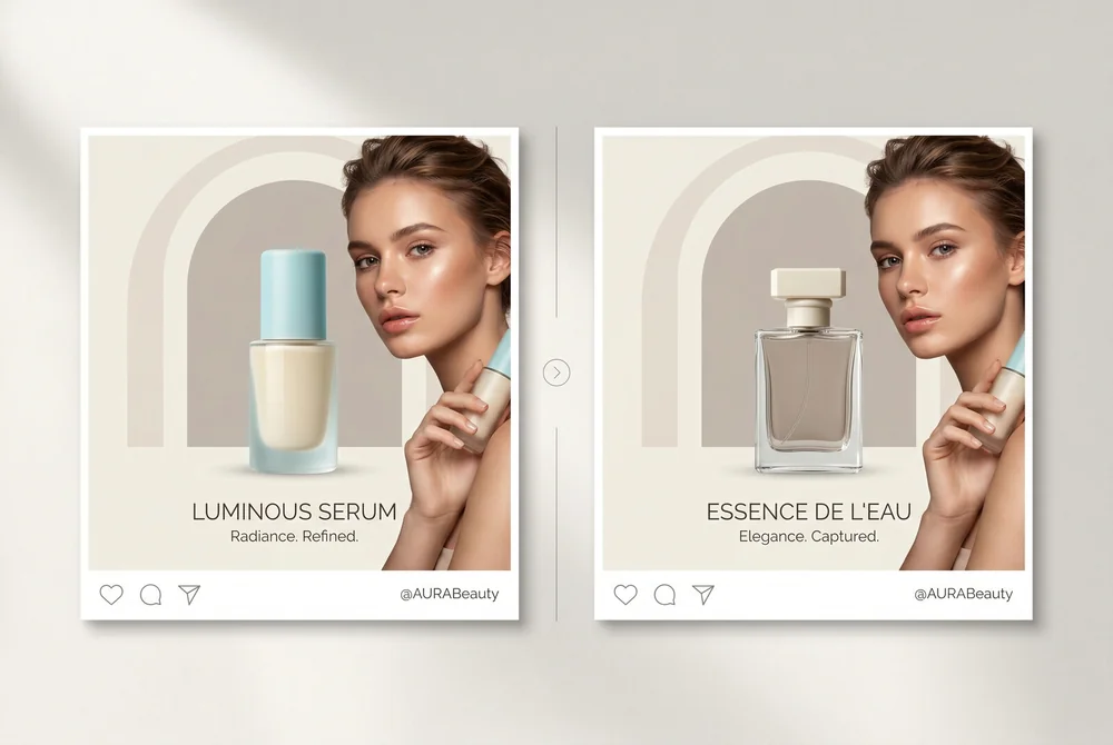
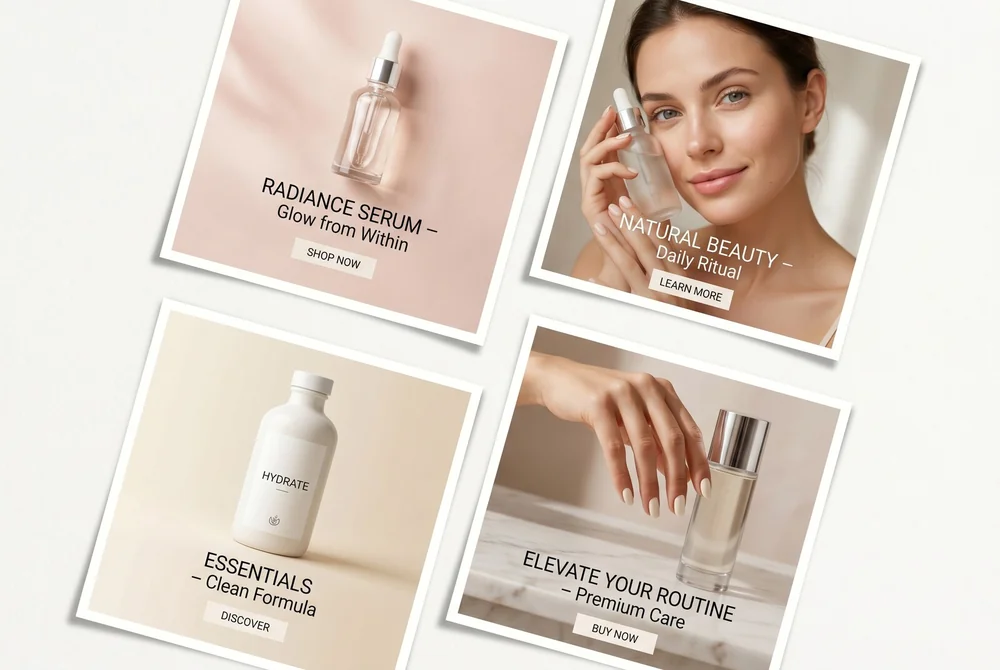
What consistency actually looks like once the kit is centralized: the same layout, the same palette and the same type across two different creatives. The tools read the kit instead of you restating your identity in every prompt.
This is also where the brand kit sits in an automated workflow: the first node, read by every generation node after it.
Brand kit vs brand book: what changes when the reader is a model
A brand book is written for people and a brand kit is written for tools, and that changes what goes in it. A brand book explains why the brand looks the way it does, with pages of rationale, mood and examples; a model cannot read rationale, it reads values. The kit keeps the decisions and drops the prose: the HEX code instead of "our warm coral", the font file and the allowed weights instead of "a confident, modern sans", the list of banned claims instead of a paragraph on responsible marketing.
| Element | In a brand book (for people) | In a brand kit (for models) |
|---|---|---|
| Colors | Named shades with a story, printed swatches | HEX values with a role: primary, secondary, accent, background, text, CTA |
| Typography | A typeface family and its personality | Two or three font files, the weight and size for heading, subheading, body, caption and button |
| Logo | Usage philosophy and examples of misuse | The files themselves (main, reversed, mark), with the minimum clear space stated |
| Product | Photography style, described | The reference photos, cut out, attached to every generation as the visual anchor |
| Tone of voice | A page on the brand personality | Three to five adjectives, two on-brand lines, two off-brand lines, and a list of banned words and claims |
| Formats | Examples of past campaigns | The placements you export to, with text zones and safe margins |
Three consequences follow. Everything in the kit has to be unambiguous, because a model will not ask a clarifying question; everything has to be a file or a value, because a model cannot open a PDF page and squint; and the kit has to say what is forbidden as clearly as what is allowed, because a model fills every gap with a plausible default.
What the SociaLover Brand Kit stores and which tools read it
The SociaLover Brand Kit stores your identity as fields, not as a document: name, logo, website and description, industry and tagline, a color set (primary, secondary, accent, background, text, plus status colors and any custom colors you add), a typography set (heading, subheading, body, caption and button, each with a family, a weight and a size), the tone of voice, the target audience, keywords, reference images with a label, social links, and a product list with the product photos. You can keep several brands and mark one as the default.
The tools read it through a Brand Identity toggle. Switch it on in a tool, pick the brand, and the generation is enriched with the brand name, industry, tagline, tone of voice, target audience, description and the primary and secondary colors; the logo, the fonts and the reference images are available to the tools that place or compose them. As of September 2026 the toggle is present in Creative Designer, Creative Remix, Text Clarity, Smart Editor, Product Studio, Creative Resizer, Background Remover, Image Enhancer, Ads Strategist, Chat Me and the home chat, and in the video tools (Creator Frames, Real Life, Content Series, UGC Creators, Video Generator, Voice Studio) as well as in the editors.
Two current limits, stated plainly. The kit enriches the prompt and the composition; it does not force a model to reproduce a HEX value to the digit or to set type in your exact font inside a generated image, so a human check against the kit stays in the chain. And the toggle is per tool and per session: if it is off, the tool generates without the kit. You manage all of it from Brand Kit (in your dashboard), and the guide "Brand Kit: Apply Your Identity Automatically" in our guides walks through the screens.
The 6 essential elements of a brand kit
Colors, typography, logo, tone of voice, visual references, formats: six elements, two of which carry a ceiling (two or three typefaces, six to twelve reference images) and none of which carries a target. Everything else is a decision you take once and write down as a value.
The example palette from element 1 below, rendered instead of written: a dark primary, a secondary that sits right next to it, a deeper accent, and a CTA color that deliberately breaks the set. That contrast is the entire job of a CTA color.
1. Color palette
Primary color (your signature color), secondary (complement), accent (calls to action), neutrals (backgrounds, text). Note the HEX, RGB, and CMYK codes for each color.
Example
Primary: #1A1A2E / Secondary: #16213E / Accent: #0F3460 / CTA: #E94560
2. Typography
Two or three fonts max: one for headlines (strong personality), one for body text (legibility), and an optional one for accents. Specify the allowed weights.
Example
Headlines: Playfair Display Bold / Body: Inter Regular/Medium / Accent: Inter Italic
3. Logo and variations
Main logo (light backgrounds), reversed logo (dark backgrounds), simplified logo (small formats), minimum clear space. In vector formats (SVG, AI).
Example
Main logo, white logo, logomark only, favicon
4. Tone of voice
Adjectives that define your voice (e.g., "direct, expert, warm"). What you are AND what you are not. Examples of on-brand and off-brand copy, and the claims you never make.
Example
In: "Generate your ads in 5 minutes" / Out: "Our innovative solution is revolutionizing marketing"
5. Visual references
A moodboard of 6 to 12 images that capture the aesthetic you are going for, plus the cut-out product photos. Useful for steering AI generators. Update it quarterly.
Example
Screenshots of competitor ads that inspire you, mood photos, color references, your packshots
6. Formats and templates
The dimensions of your main formats (1:1, 9:16, 16:9, 4:5) with predefined text zones. Grids and safe margins.
Example
Template 1080x1080 Meta Feed, 1080x1920 Story/Reels, 1200x628 Link Preview
Build your brand kit in 30 minutes
Thirty minutes is enough for a first version that the tools can read, provided you collect before you decide: most brands already have the colors, the logo files and a few lines of tone somewhere, and the work is putting them into fields. Here is the plan, step by step, with the time each step deserves.
Thirty minutes, in five steps, with the time weighted toward the two that people skip: assigning a role to every color rather than pasting a list, and writing what the brand never says. The last step is the only one that matters to a model: a generation compared against the kit, and one field corrected.
Once the kit exists, the prompts get shorter, because the HEX codes, the fonts and the tone no longer need to be typed. Our library of prompts that respect your brand shows what a prompt looks like when the kit carries the identity and the sentence only describes the scene.
Common brand-kit mistakes with AI
The mistakes that break consistency with AI are not design mistakes, they are ambiguity mistakes: a value the model has to guess, a rule that is implied instead of stated, a reference that is missing. The two columns below are the ones we see most often in kits that fail at generation time.
- • HEX values with a role for each: the model is told which color is the background and which one is the button
- • Font files and allowed weights, so the tools that compose text can actually set it
- • Cut-out product photos attached as references, so the packaging stays identical across scenes
- • A banned list: words, claims, competitor names and visual clichés the brand never uses
- • One kit per brand or per client, each with its own default, instead of one kit with exceptions
- • A quarterly refresh of the moodboard and a re-test of one creative against the kit
- • Color names instead of values ("warm coral", "our navy"): every model reads them differently
- • A brand book PDF uploaded as the kit: a model cannot read rationale, only fields
- • Describing the product in words when a reference photo exists: the model redraws it every time
- • Restating the identity in every prompt while the kit toggle stays off: the two drift apart
- • Trusting the kit to enforce itself: it enriches the generation, a human still checks the output
- • One kit stretched across several clients with "except for" rules nobody applies
The models themselves also differ in how well they hold a brand style from one generation to the next, which is worth knowing before you blame the kit. Our comparison of which image models hold a brand style scores them on consistency and on the text they can render in your typeface.
Using the brand kit in your AI tools
Load it once, then let each tool read it: image generators take the HEX values and the references, the SociaLover tools take the whole kit through the Brand Identity toggle, language models take the tone of voice in their instructions, and design editors take the palette and fonts at workspace level. Here is how to plug it into each.
Image generators (FLUX.2, Nano Banana Pro and 2, GPT Image 2)
Include the HEX colors and attach the reference images: "[COLOR HEX] color palette, [BRAND] aesthetic", plus the cut-out product photo as a reference so the packaging never drifts.
SociaLover Brand Kit
Centralize your logo, colors, fonts, tone and references in your dashboard, then switch the Brand Identity toggle on in Creative Designer, Studio Image, Chat Me, Ads Strategist and the video tools. The generation is enriched with the kit automatically.
LLMs for copy (Claude, ChatGPT, Gemini)
Include your tone of voice in the system prompt: "Write in the tone of [BRAND]: [ADJECTIVES]. Never use: [BANNED WORDS AND CLAIMS]." In SociaLover, Chat Me and Ads Strategist read it from the kit.
Graphic editors
Most design editors let you save a brand palette and your fonts at the workspace level. Import them there too, so the manual work stays aligned with what you generate.
Brand kit checklist (copy and paste)
Six rows, one per element: what you store, and where it is actually consumed in an AI workflow. Copy it into your brand document and fill in the middle column; if a cell holds an adjective instead of a value or a file, it is not ready for a model yet.
| Element | What you store | Where it is used |
|---|---|---|
| 1. Color palette | HEX, RGB and CMYK for the primary, secondary, accent and neutrals, each with a role | Pasted into image prompts as "[HEX] color palette", and applied by the creation tools |
| 2. Typography | Two or three typefaces, with the weights you allow, for heading, body, caption and button | Every text layer: headlines, body copy, accents |
| 3. Logo and variations | Main, reversed, logomark and favicon in vector format, plus the minimum clear space | Uploaded once into the Brand Kit and reused by the creation tools |
| 4. Tone of voice | The adjectives that define your voice, on-brand and off-brand examples, the banned words and claims | The LLM instructions: "Write in the tone of [BRAND]: [ADJECTIVES]" |
| 5. Visual references | A moodboard of 6 to 12 images, refreshed quarterly, plus the cut-out product photos | Steering image generators toward the right aesthetic, and anchoring the product |
| 6. Formats and templates | Your 1:1, 9:16, 16:9 and 4:5 dimensions with text zones, grids and safe margins | Every export, so a creative is cut for each placement |
Frequently asked questions
- What is a brand kit?
- A brand kit is the machine-readable set of rules that defines a brand's identity for the tools that produce its content: logo files, HEX colors with a role, two or three typefaces, product references, tone of voice, banned claims and export formats. In an AI workflow it is also what drives and constrains every generation tool you use, because it is what every tool reads.
- What is the difference between a brand kit and brand guidelines?
- Brand guidelines (or a brand book) are written for people: they explain why the brand looks and sounds the way it does, with rationale and examples a designer interprets. A brand kit is written for tools: it keeps the decisions as values and files (HEX codes, font files, logo files, reference photos, a banned list) and drops the prose, because a model applies literally and cannot ask a clarifying question.
- What should a brand kit contain?
- Six elements: the color palette with HEX, RGB and CMYK codes and a role for each color; two or three typefaces with their allowed weights; the logo and its variations in vector format; the tone of voice with on-brand and off-brand examples and the banned claims; a moodboard of six to twelve visual references plus the cut-out product photos; and the formats and templates you export to.
- Can I have several brand kits for several clients?
- Yes. In SociaLover you can store several brands in your dashboard, each with its own logo, colors, typography, tone, references and products, and mark one as the default. When you switch the Brand Identity toggle on in a tool, you pick the brand for that session, so an agency keeps one kit per client instead of one kit with exceptions that nobody applies.
- Does the brand kit apply to video too?
- Yes. The Brand Identity toggle is present in the video tools (Creator Frames, Real Life, Content Series, UGC Creators, Video Generator, Voice Studio) as well as in the image tools, so the brand name, tone, audience and colors enrich the video generation the same way. The frames, the script and the voice-over then start from the same identity as the stills, which is what keeps a campaign consistent across formats.
- Can AI keep my product identical across images?
- Close to it, if the product is in the kit as a photo rather than as a description. Attach the cut-out product photo as a reference image (FLUX.2, Nano Banana Pro and 2 and Seedream 4.5 accept references) and describe only the scene: the packaging and proportions stay put while the surface, light and background change. Fine detail such as engraved text can still drift, so the human check against the kit stays in the chain.
- Why does a brand kit matter more with AI?
- Because without a central kit, each tool produces in its own palette: Creative Designer in one, Studio Image in another, the video tools in a third. The result is a fragmented identity that hurts recall and trust, and the more you generate, the faster it fragments. With the kit read at every generation, 200 creatives a week share one palette, one type and one voice.
- How do you feed a brand kit to an image generator?
- Put the HEX codes directly in the prompt, in the form "[HEX] color palette, [BRAND] aesthetic", and attach the reference images, including the cut-out product photo. In SociaLover the kit is stored in your dashboard instead, and the Brand Identity toggle applies it to what the tools generate, so the prompt only has to describe the scene.
- How often should the visual references be updated?
- Quarterly. The moodboard is what steers the aesthetic direction of your AI generations, so it is the element worth putting on a recurring refresh, along with a re-test of one creative against the kit. Six to twelve images that reflect where the brand is going, not where it was, plus the current packshots.
Conclusion
A well-built brand kit is what turns a pile of AI tools into a coherent production line. You produce faster and, above all, more consistently. SociaLover includes a built-in Brand Kit where you store your logo, colors, fonts, tone, references and products once, so the creation tools can read them instead of you re-specifying your identity in every prompt.